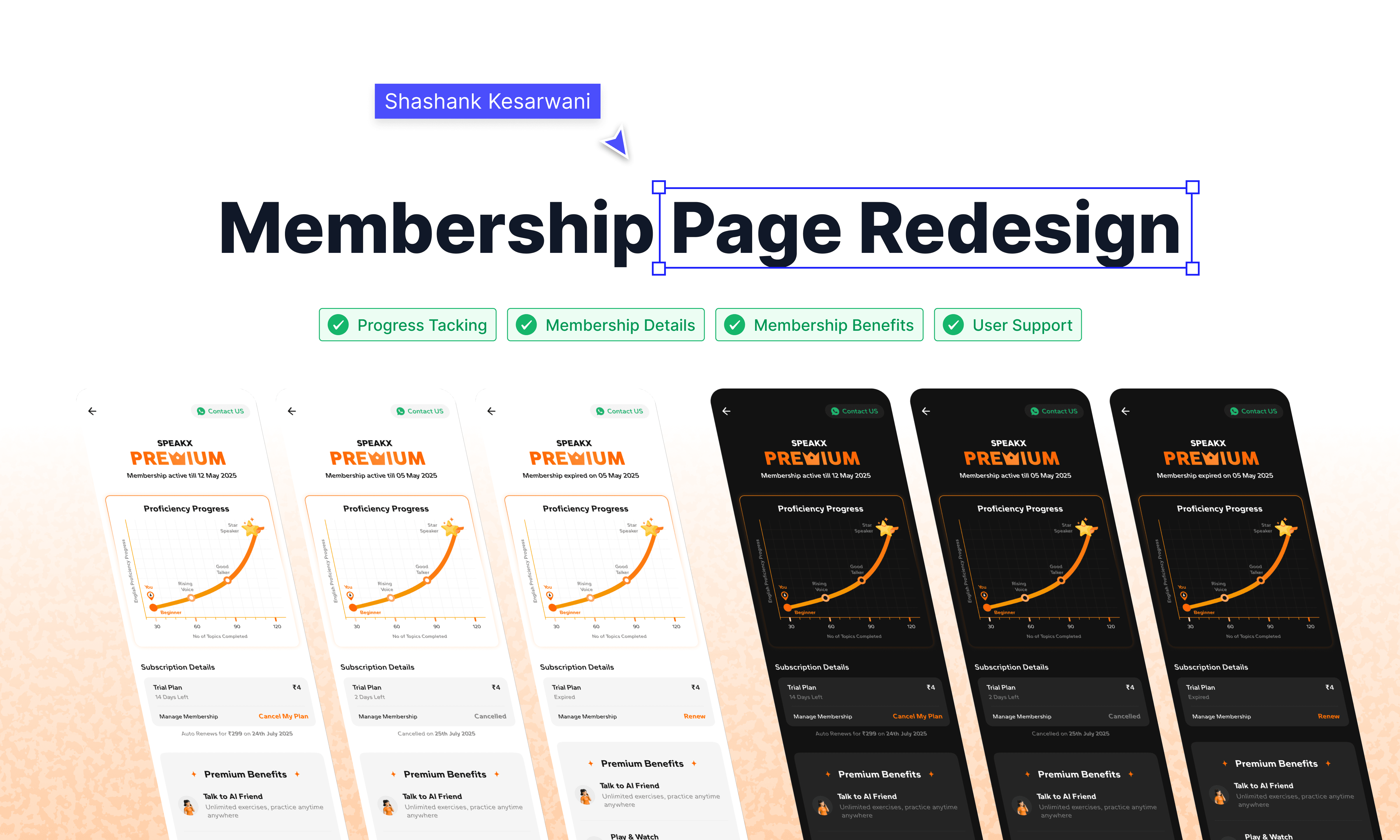
Redesigning the Membership Page to Reduce Cancellations

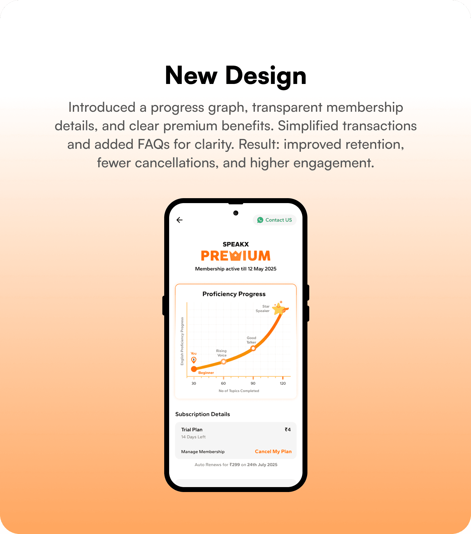
Redesigned the membership page to tackle high Day-0 and week-1 cancellations. Introduced a dynamic progress graph, transparent subscription details, and clear premium benefits. Result: cancellations reduced by up to 8% and user engagement increased.

Background

While reviewing retention metrics at SpeakX, I noticed a concerning pattern:

  • ~20% of users cancelled on Day 0 (immediately after subscribing).

  • Nearly 50% of trial users cancelled within the first week.

A deeper investigation revealed two key issues:

  1. Lack of visible progress → Users couldn’t see how far they had come in their learning journey, which reduced motivation.

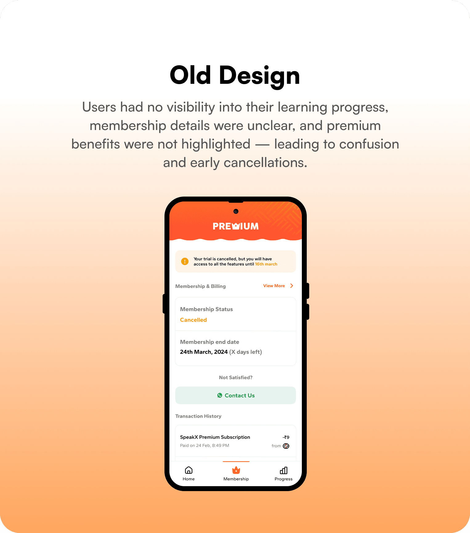
  2. Unclear membership details → Cancellation, renewal, and plan status were difficult to understand, creating confusion and drop-offs.

It was evident that our membership page wasn’t doing enough to build trust, communicate value, or motivate retention.

My Role

I owned this initiative end-to-end — from identifying the problem, proposing the redesign, aligning stakeholders, working with design and engineering, to setting up the A/B test and analyzing results.

Approach

I redesigned the membership page to make it progress-driven, transparent, and value-focused.

Key Improvements:

  1. Dynamic Learning Progress Graph

    • Visual chart mapping a learner’s journey from Beginner → Fluent Speaker.

    • Milestones like “Rising Voice” and “Star Speaker” added to gamify the experience and show tangible growth.

  2. Clear Membership & Cancellation Details

    • Status-based UI for Active, Expired, and Cancelled users.

    • Transparent cancellation and renewal flows, reducing ambiguity.

    • Highlighted special offers (e.g., ₹99/month savings) in a design-referenced strip.

  3. Premium Value Reinforcement

    • Clearly displayed benefits: AI conversation practice, grammar mastery, reel-based learning, and daily practice routines.

  4. Supportive Elements

    • Simplified transaction history (latest shown by default, expandable for full history).

    • Inline FAQs for self-help.

    • Contact Us button for quick support and a Back button for easy navigation.


Experiment Design

To validate impact, I ran an A/B test:

  • Control group → Old membership page.

  • Test group → Redesigned page with new progress graph, subscription clarity, and benefits showcase.

To validate impact, I ran an A/B test:

  • Control group → Old membership page.

  • Test group → Redesigned page with new progress graph, subscription clarity, and benefits showcase.

To validate impact, I ran an A/B test:

  • Control group → Old membership page.

  • Test group → Redesigned page with new progress graph, subscription clarity, and benefits showcase.

Results

The redesigned page delivered measurable improvements:

  • Day 0 cancellations reduced by 3%

  • Overall cancellations reduced by 4%

  • In-app cancellations reduced by 8%

  • Day 0 engagement increased by 1%, with users spending more time on the page.

The redesigned page delivered measurable improvements:

  • Day 0 cancellations reduced by 3%

  • Overall cancellations reduced by 4%

  • In-app cancellations reduced by 8%

  • Day 0 engagement increased by 1%, with users spending more time on the page.

The redesigned page delivered measurable improvements:

  • Day 0 cancellations reduced by 3%

  • Overall cancellations reduced by 4%

  • In-app cancellations reduced by 8%

  • Day 0 engagement increased by 1%, with users spending more time on the page.

Impact

The redesign not only reduced churn but also gave users:

  • A sense of progress in their learning journey.

  • Clarity and confidence around their subscription.

  • Stronger motivation to continue their premium membership.

Create a free website with Framer, the website builder loved by startups, designers and agencies.