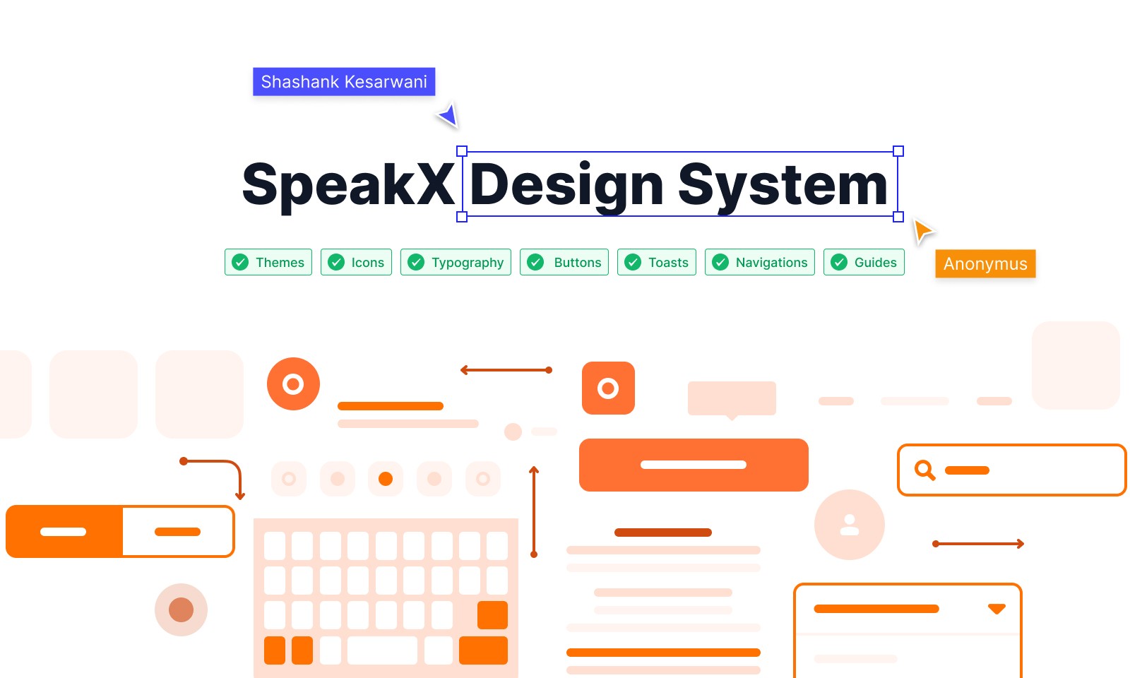
Building a Design System from Scratch

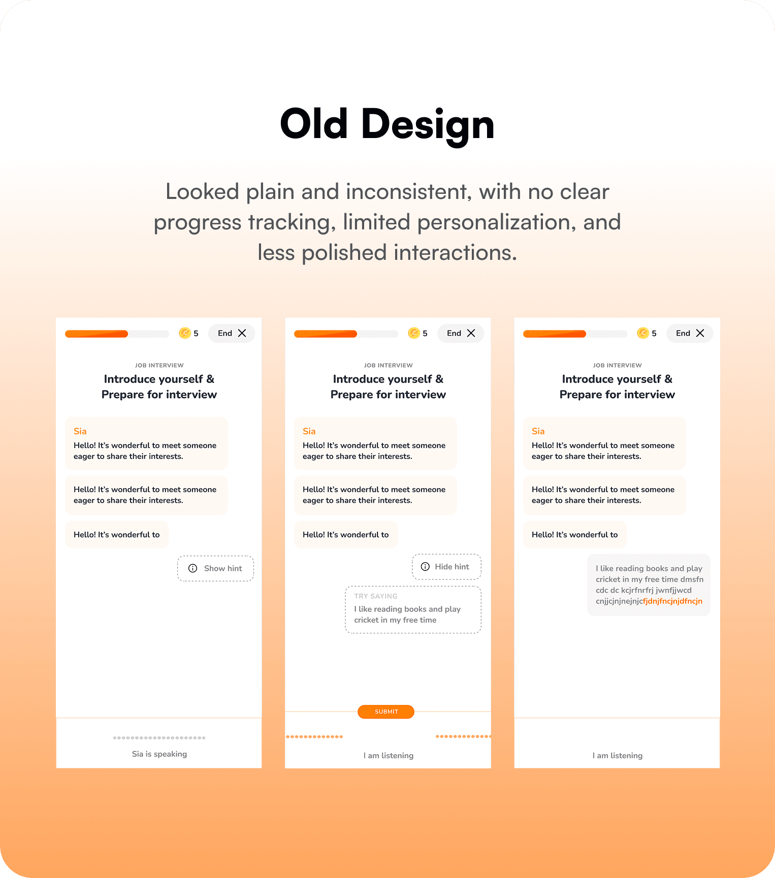
When I joined the project, the product designs were scattered across Sketch files, inconsistent in styles, and hard to maintain. Developers often faced issues implementing designs due to duplicated components, varying colors, and mismatched typography. I saw this as an opportunity to create a unified design system that would streamline the workflow for both designers and developers.

Challenge

  • Multiple duplications of components across files.

  • Inconsistent colours, typography, and spacing.

  • No clear structure for reusable assets.

  • Time wasted during updates (every change had to be applied manually to multiple screens).

  • Developers struggled with lack of standardized tokens.

This was slowing down the product team and creating inconsistencies in the user experience.

My Role

My Role

My Role

  • Migrated designs from Sketch to Figma

  • Researched existing patterns and industry best practices

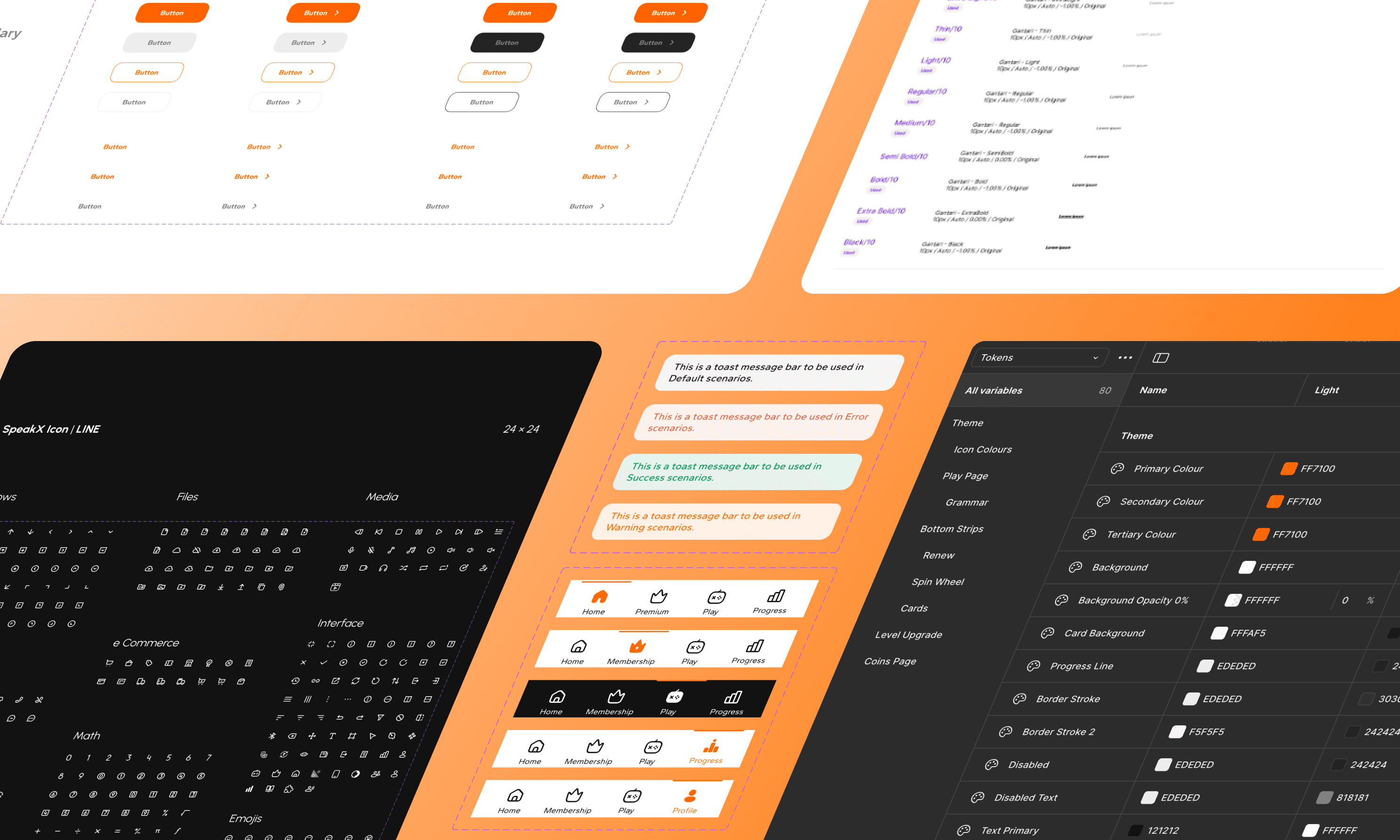
  • Created the foundation and components of the new design system

  • Worked closely with developers to mirror the design system in code

The Process

The Process

The Process

1. Setting the Foundations

  • Established colour tokens for light and dark themes

  • Defined typography styles for headings, body text, captions, etc.

  • Created grid systems, spacing, and margin scales for consistency


2. Creating Components

I built reusable and scalable components, including:

  • Buttons (primary, secondary, states)

  • Logos and icons

  • Navigation components

  • Toast notifications

  • Layout grids

  • Typography tokens


3. Developer Collaboration
To ensure smooth handoff, I initiated the same system on the development side. Developers implemented design tokens for colours, typography, and spacing, ensuring one-to-one mapping between design and code. This meant:

  • Faster Implementation

  • Reduced rework

  • A hassle-free update process

The Outcome

The Outcome

The Outcome

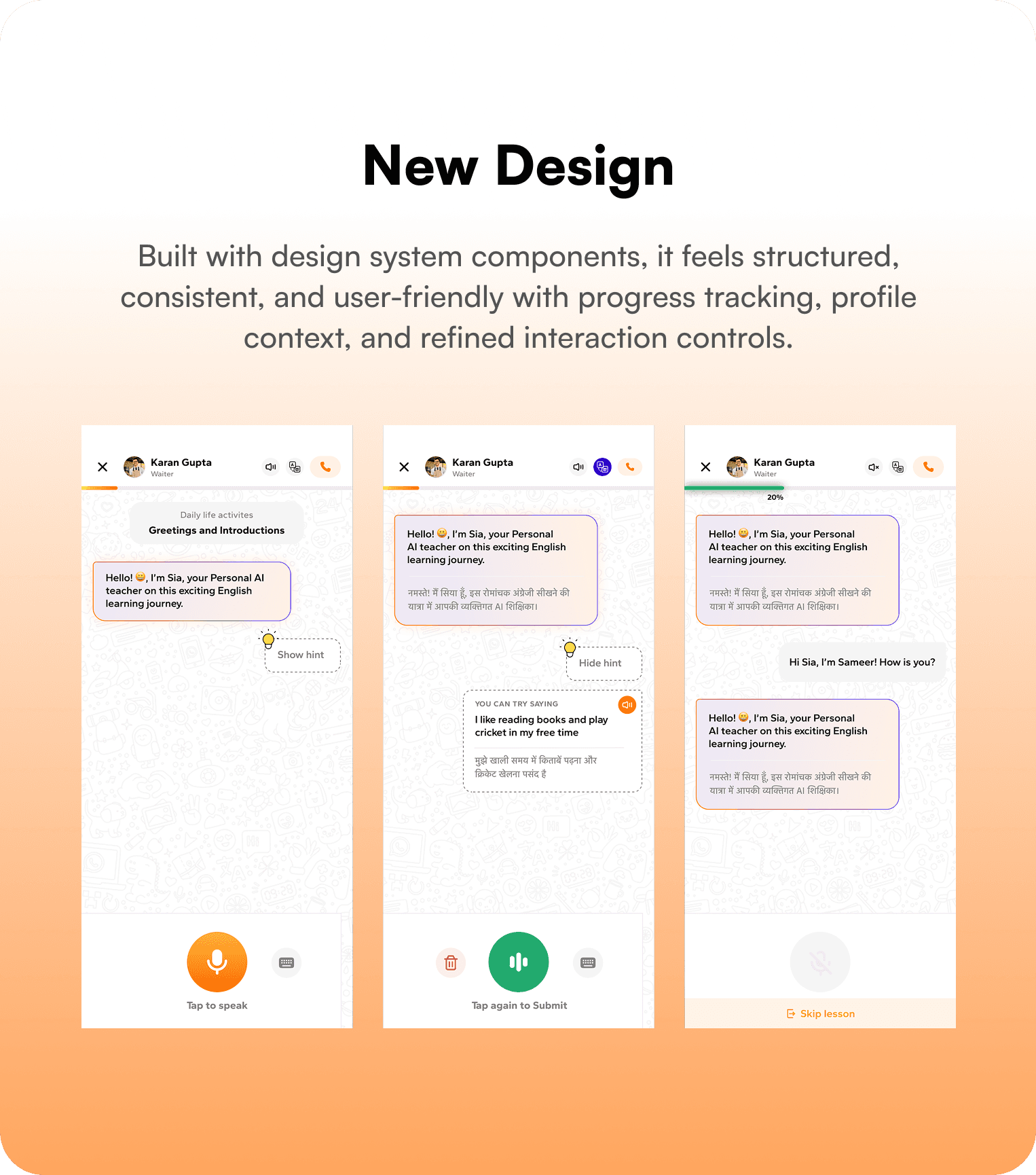
  • Consistency: Every screen now follows the same design language

  • Efficiency: One update reflects across all instances instantly

  • Scalability: New themes or components can be added without disrupting the system

  • Developer-Friendly: Developers work with the same tokens, reducing confusion and saving time

Impact

Impact

Impact

  • Reduced design-to-development friction

  • Improved speed of design iterations

  • Cleaner, scalable product design

  • Created a strong foundation for future growth of the product

Key Takeaways

Key Takeaways

Key Takeaways

  • Early collaboration with developers is essential

  • A strong foundation (colours, typography, spacing) makes scaling smoother

  • A well-structured design system not only helps designers but significantly accelerates development

Create a free website with Framer, the website builder loved by startups, designers and agencies.